♥️ & 🙊
💼 / 🤖/ 💰
Mailchimp Brand
Exploratorium AD
Airbnb Arthouse
Nike Jeter Bodega
Popup Mag: LESI
Instagram Lobby
Internet.org
Ciné A (Cinéasie)
Dr. Jekyll & Mr. Hyde
🎱
🌎🛸📸
Per(d)u
hello(☎️)davidminhnguyen.com
Instagram / Behance / Linkedin
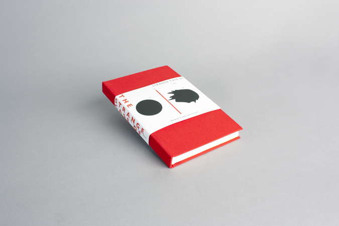

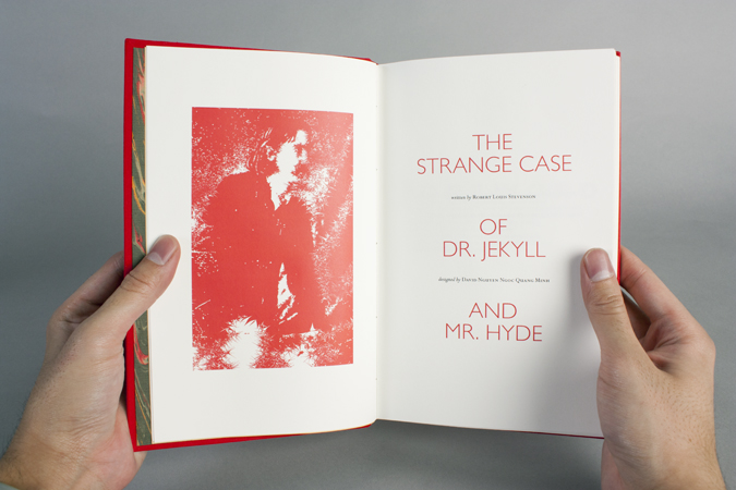
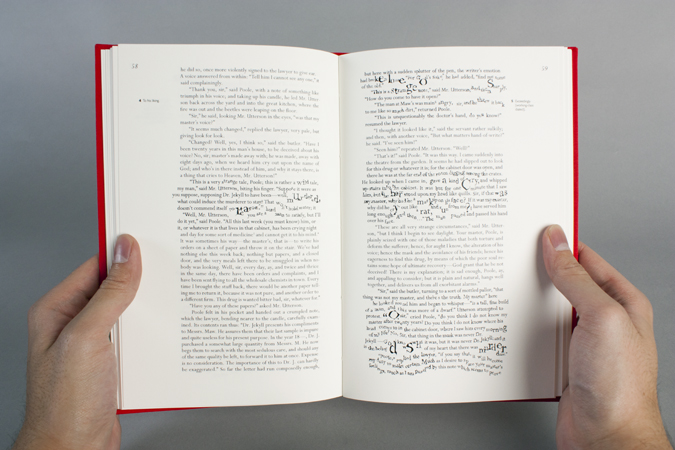


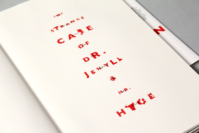


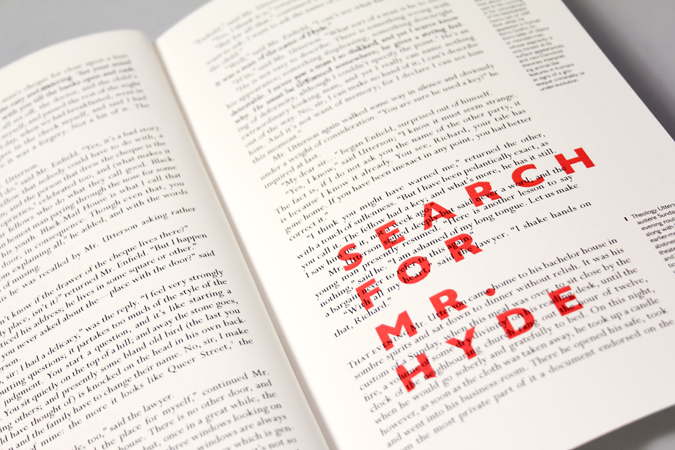

The design of this book explores the experience of the reader as he progresses through the story. As the suspense grows the text warps typographically in parallel with the transformation that Dr. Jekyll goes through in the story. The publication subverts the traditional elements of book design. with a blank page section pointing to Dr. Jekyll’s blackout and having text that is barely legible when Mr. Hyde is at the peak of his frenzy.
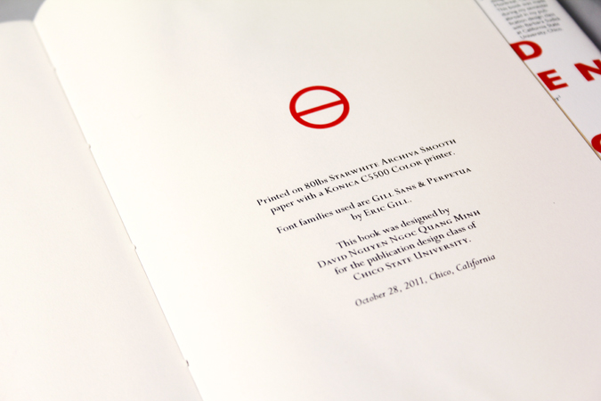
Type set in Eric Gill’s fonts, Perpetua and Gill Sans, the typefaces refer to the dual nature of the characters found in the story by tying it back to Eric Gill’s own twisted personal life and ascetic professional life.
Role: Designer Teacher: Barbara Sudick